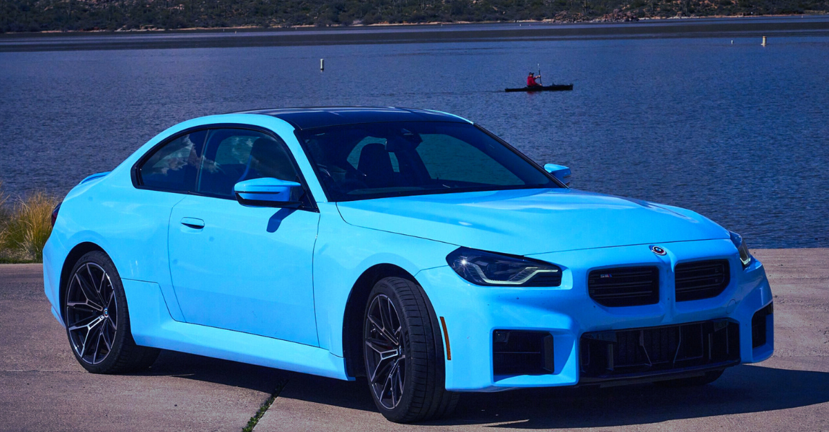
When it comes to design, BMW has always walked the fine line between tradition and innovation. But in a surprising move, the German automaker recently introduced a refreshed version of its iconic logo—and most people didn’t even notice it at first. The subtlety of the update sparked curiosity across the automotive community, leaving fans wondering: how did BMW manage to hide its new logo in plain sight?
The Evolution of an Icon
BMW’s blue-and-white roundel has remained one of the most recognizable emblems in the world for over a century. While brands often take bold steps when rebranding, BMW chose a minimalist route. Instead of dramatic redesigns, the company opted for a cleaner, flatter, and more modern aesthetic. The outer black ring was replaced with a transparent design, making the logo appear more seamless when placed on digital platforms and vehicles.
Where Was It Hiding?
What’s fascinating is that the logo had already been quietly integrated into BMW’s marketing campaigns, concept vehicles, and digital media months before its official acknowledgment. It was hiding in plain sight—in press kits, on show car dashboards, and even on social media visuals. Because the differences were so subtle, many fans overlooked the change entirely, assuming it was a trick of lighting or design variations in renderings.
Why the Subtle Shift?
BMW’s decision reflects a broader industry trend. With car brands moving towards electric and digital-first futures, logos are being adapted for online visibility and futuristic aesthetics. A flatter, sleeker logo works better on screens and matches the clean lines of modern automotive design. The shift symbolizes BMW’s transformation from a traditional automaker into a forward-looking mobility company.
Fan Reactions: From Shock to Appreciation

Once eagle-eyed enthusiasts spotted the difference, the news spread quickly. Reactions were mixed—some criticized the design for being too plain, while others applauded BMW for retaining the brand’s heritage while embracing modernity. The subtle rollout itself was seen as a clever marketing tactic, creating buzz without a loud announcement.
BMW’s new logo is proof that change doesn’t always have to be radical to make an impact. By hiding the update in plain sight, the brand not only demonstrated confidence in its timeless design but also highlighted its vision for the digital future. In an era of flashy rebrands, BMW’s quiet evolution reminds us that sometimes, the smallest shifts make the loudest statements.


